Client:
This client, based in DC, has an exchange program where international medical students who wish to apply to an American medical school must go through a wizard-form application process to register for the fall and spring semesters. My objective was to facilitate the application process.
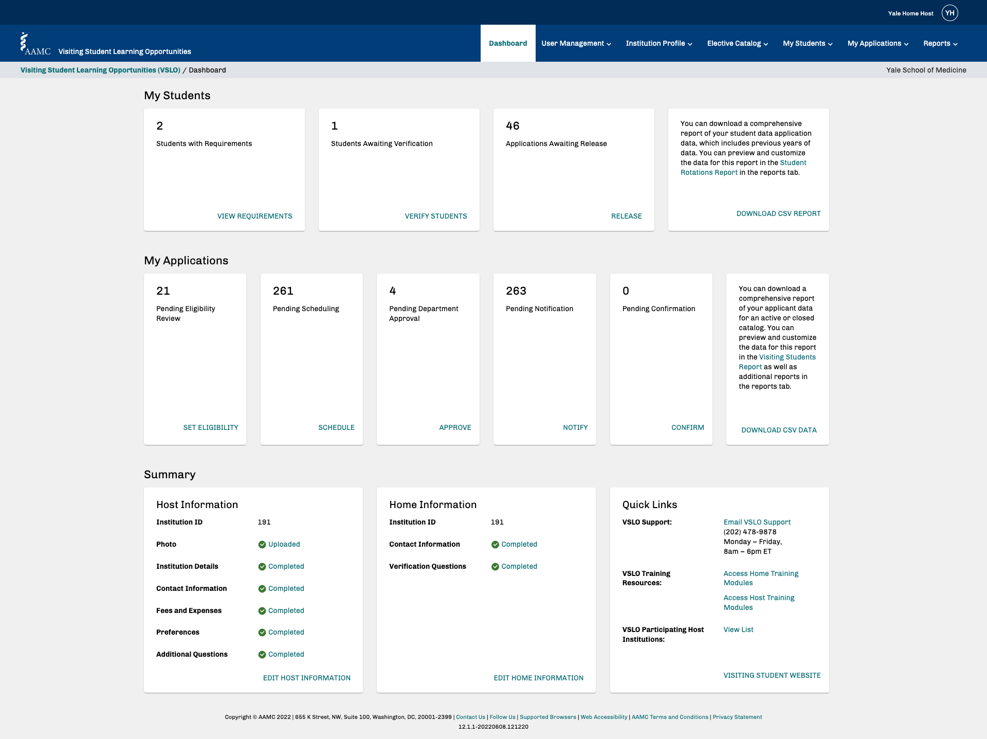
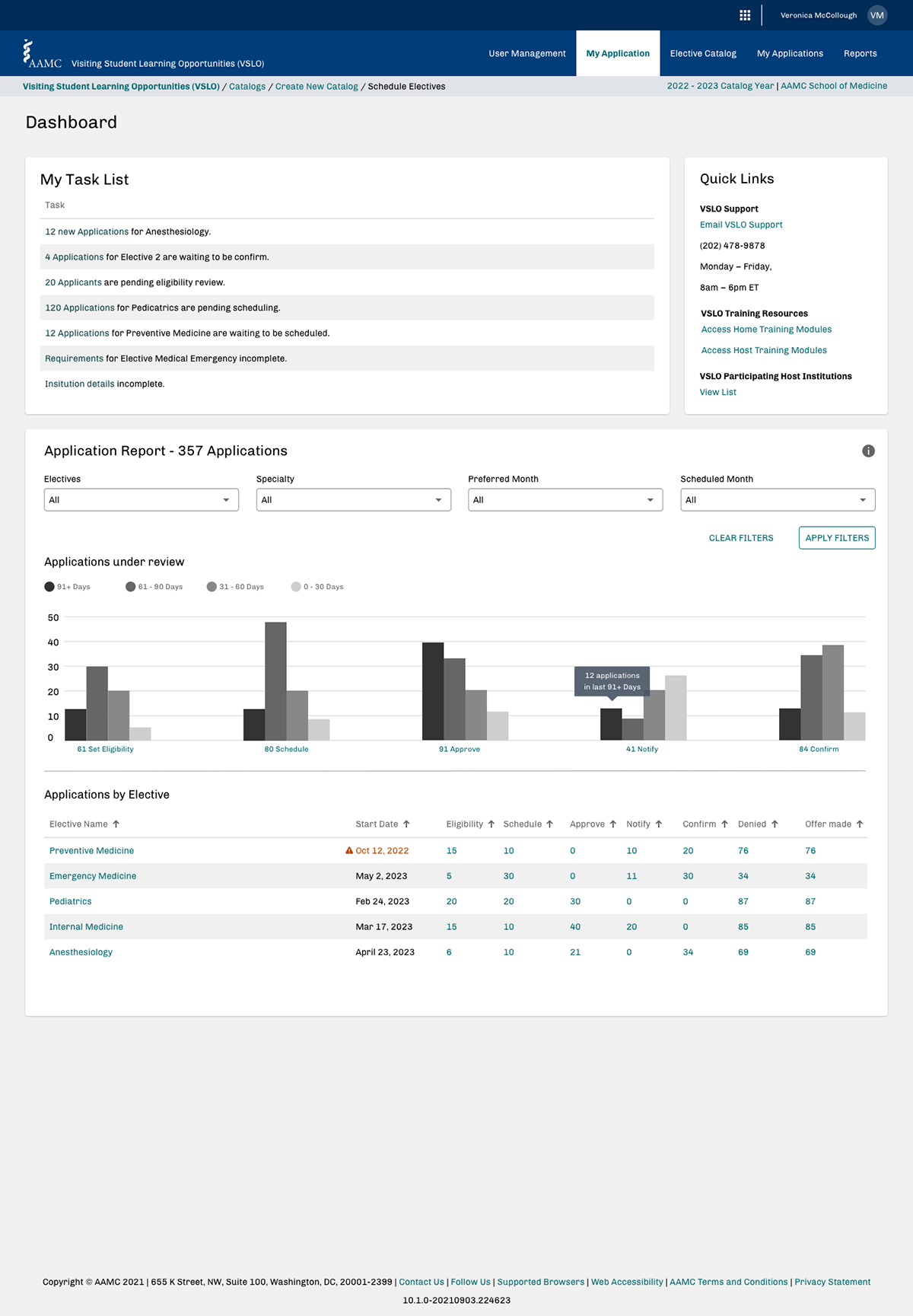
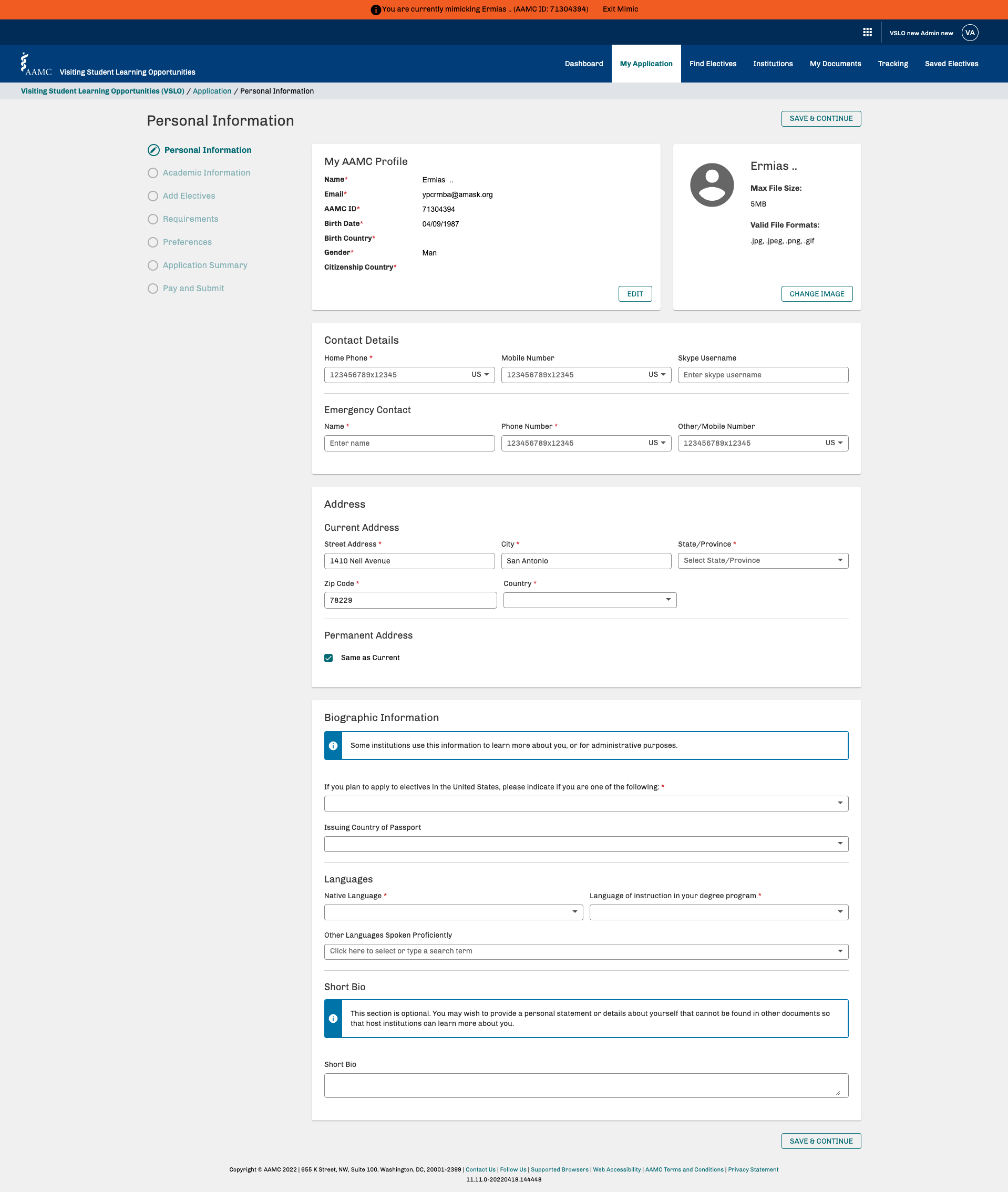
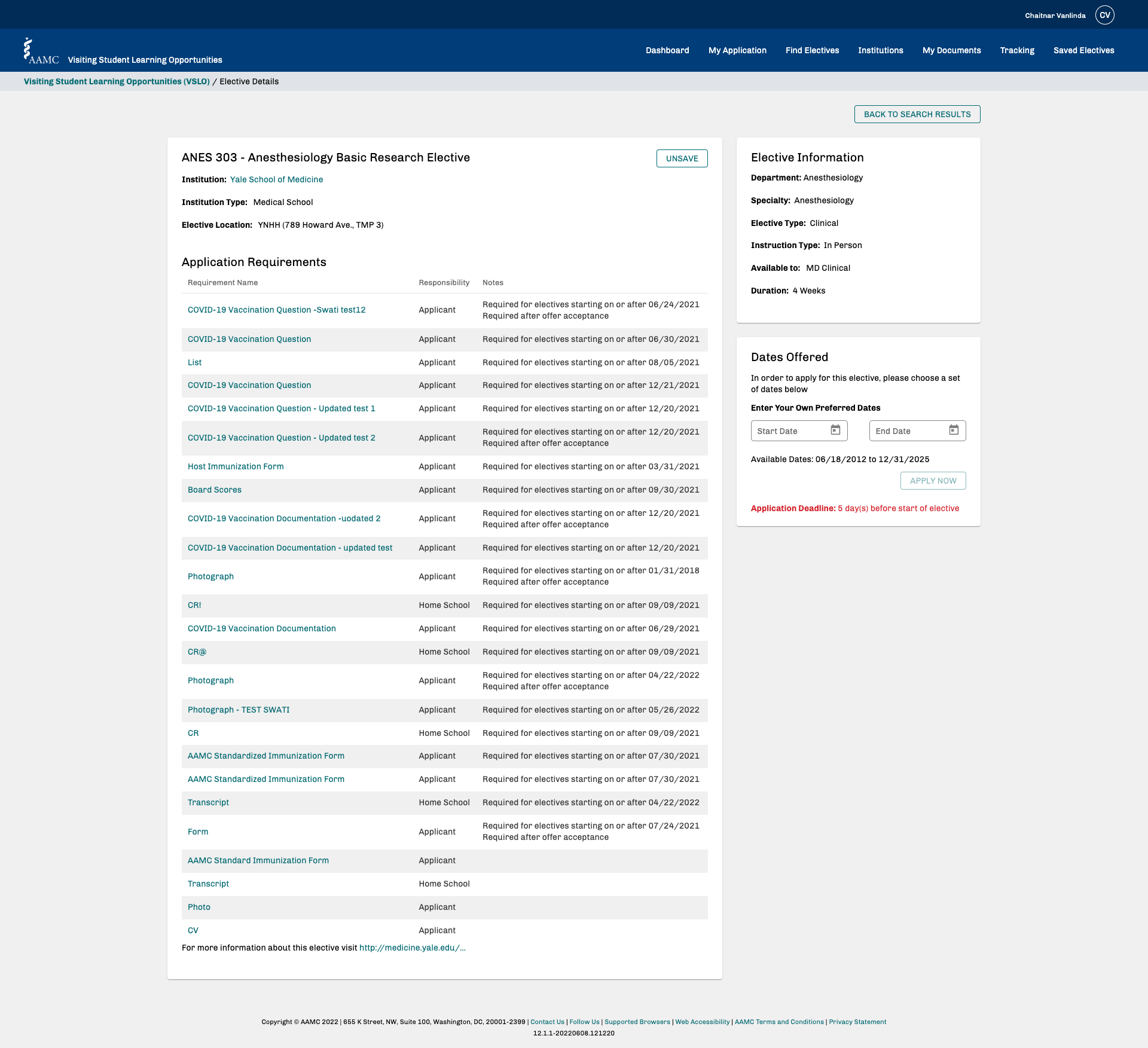
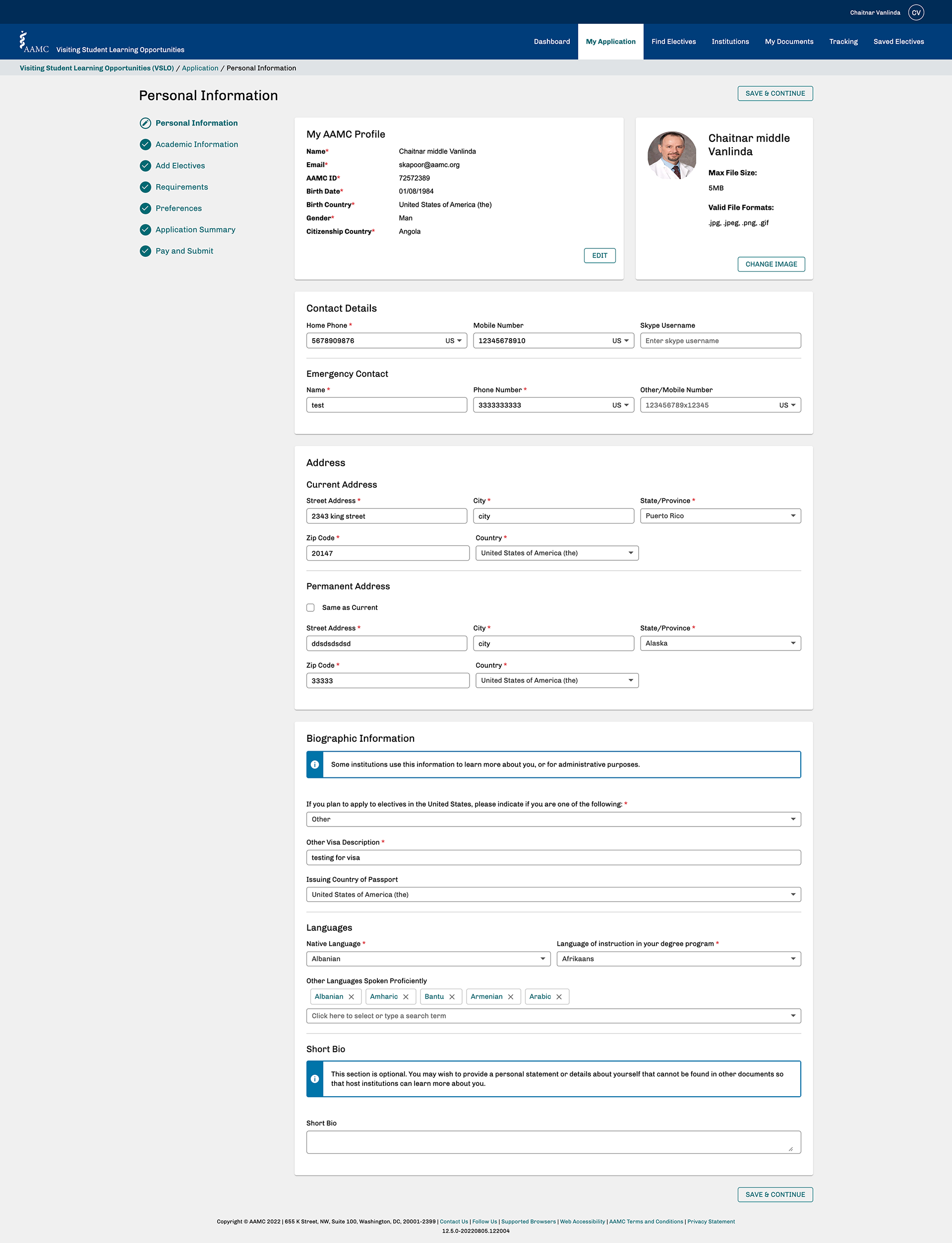
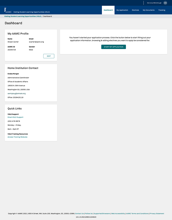
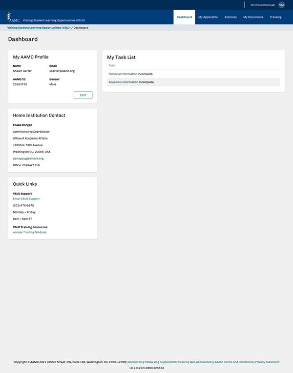
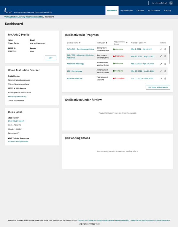
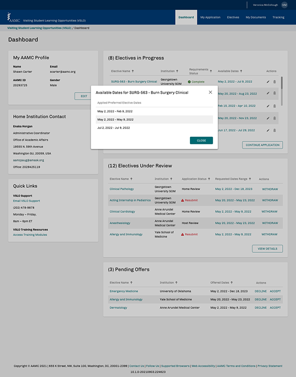
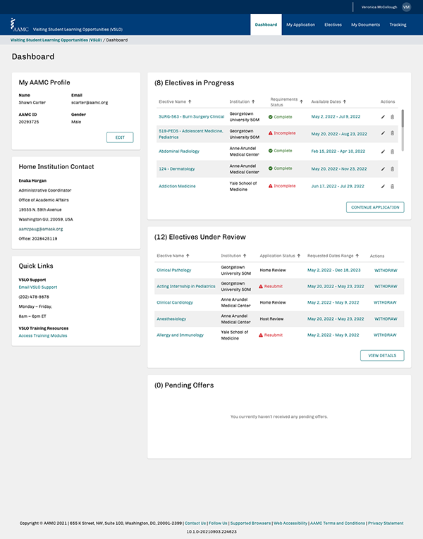
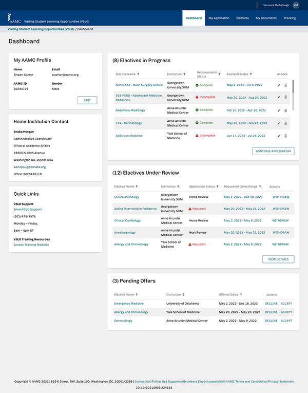
A main issue students and professors were facing was the dashboard. While both user personas had an overview of data relating to their account, the numbers were rather meaningless without context of student capacity, proximity to deadlines, or where they were in the application process. The screen on the right side bubbled up important information as an actionable task list, and the data charts gave better segmentation of the applicants and required information.
Segmented user journeys by persona.
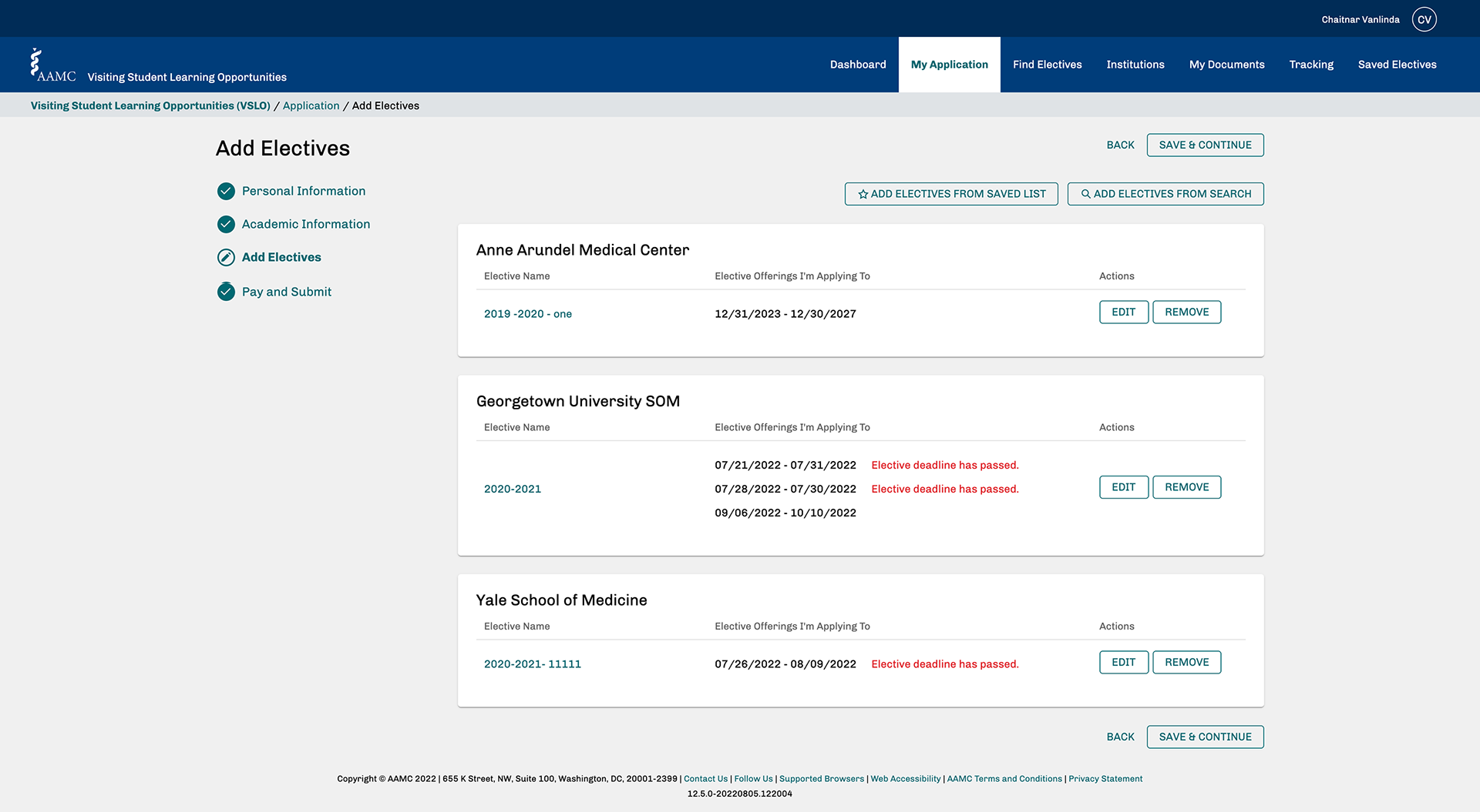
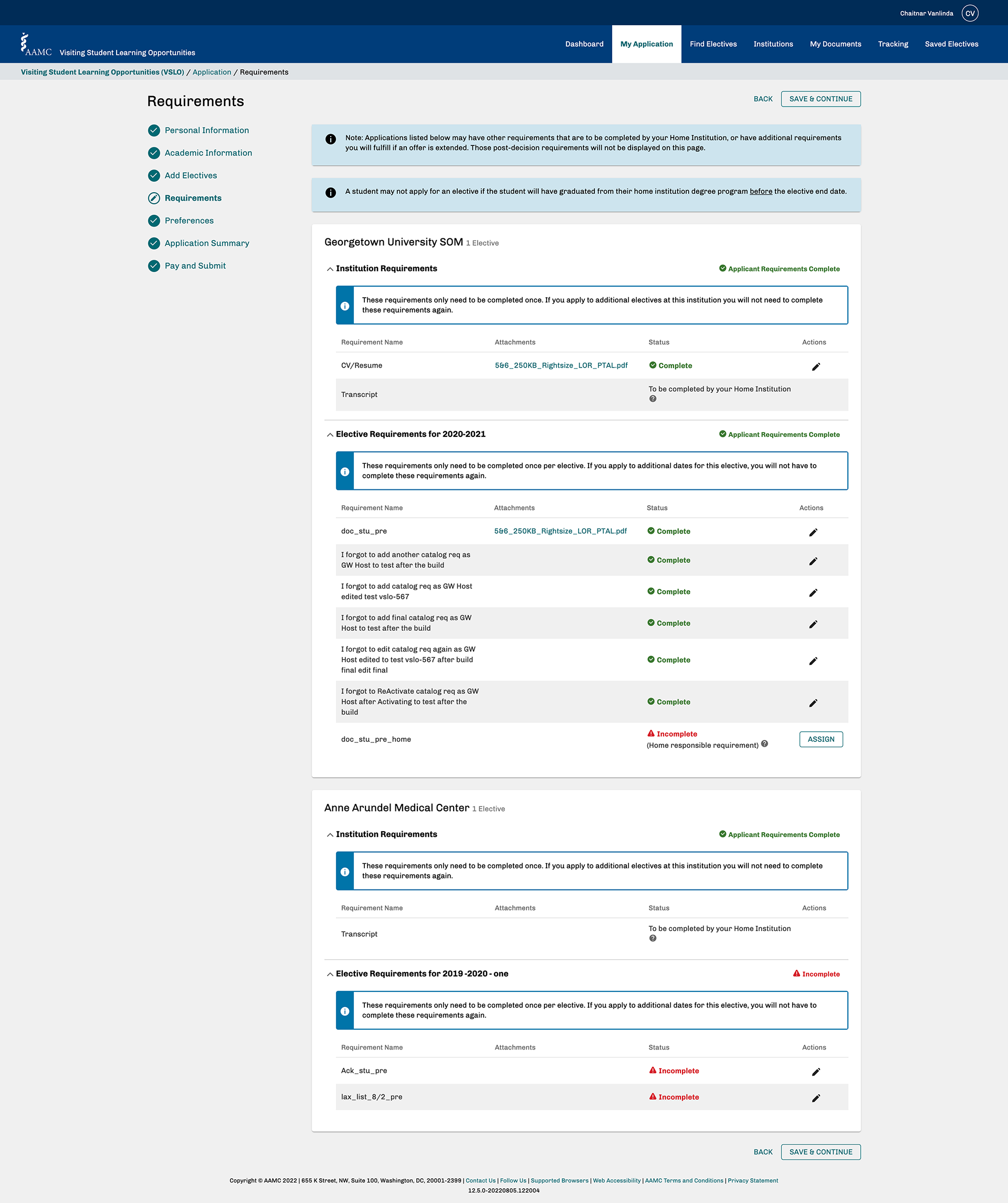
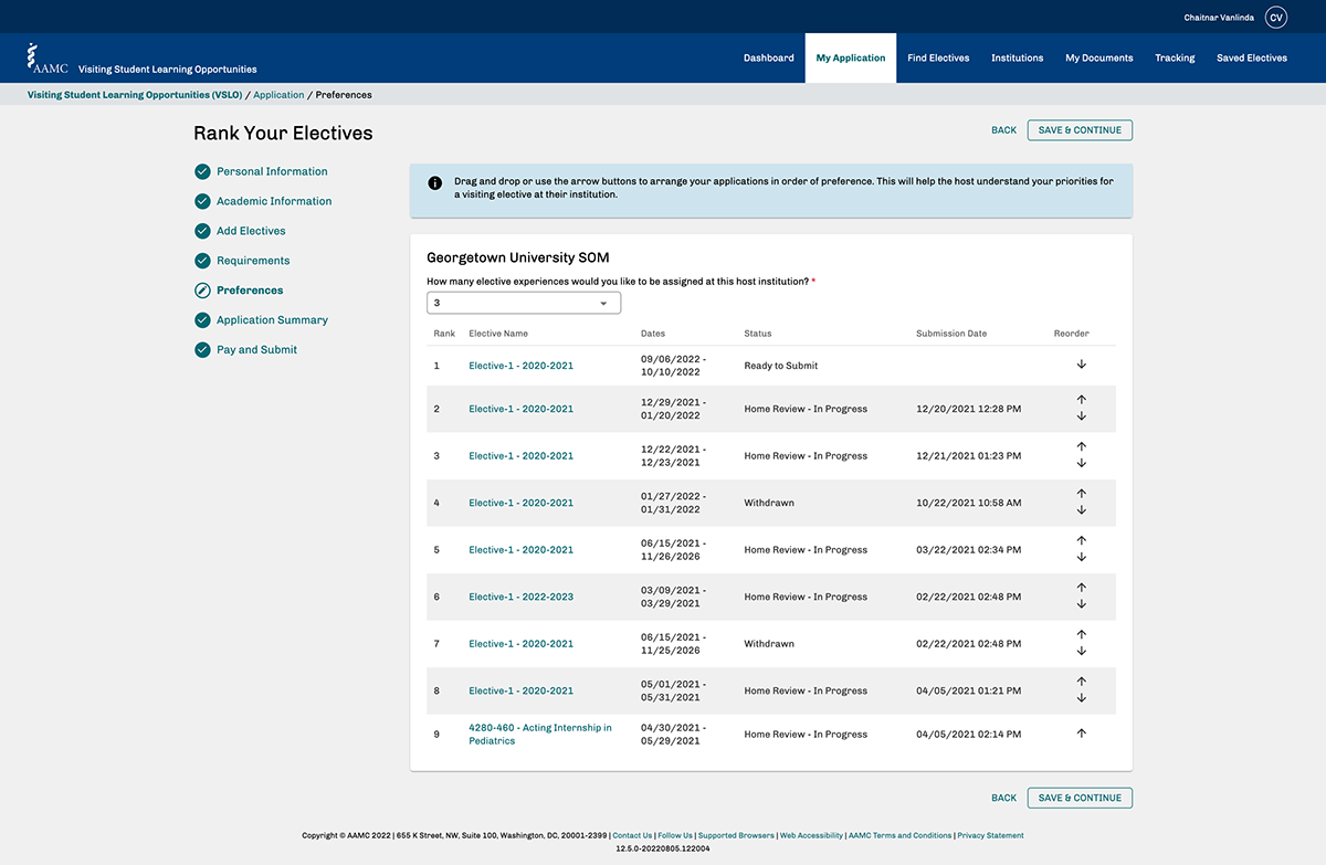

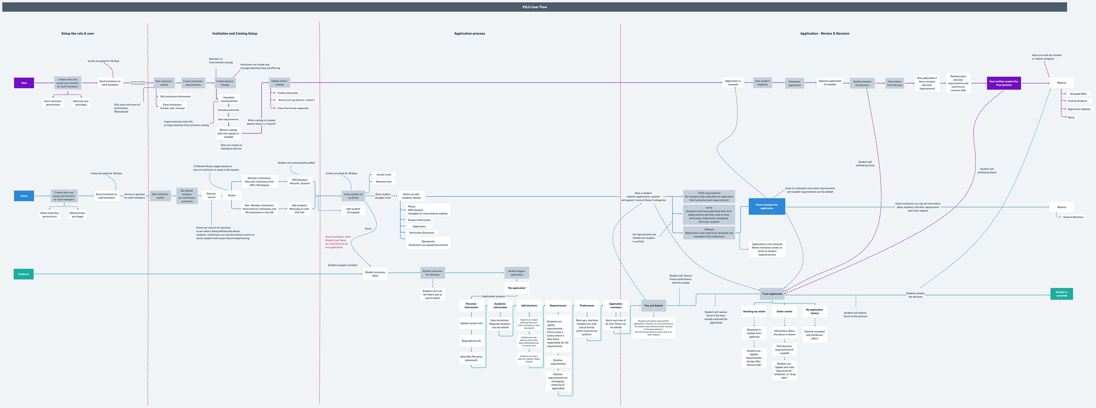
The interface, while appearing to have a linear application process, wasn't actually so. There were repeating cycles of information as classes filled up and students dropped out (most pertinent to waitlisted applicants).
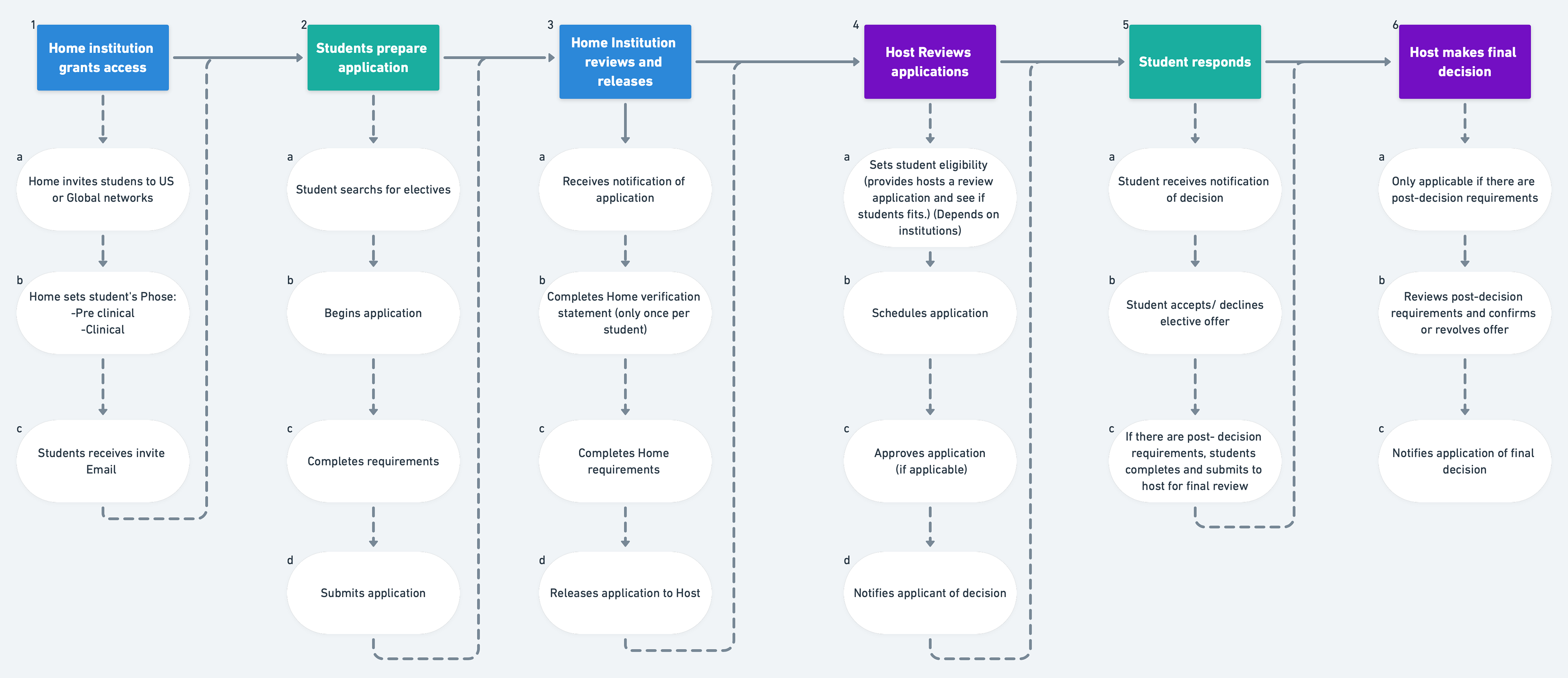
high-level application process
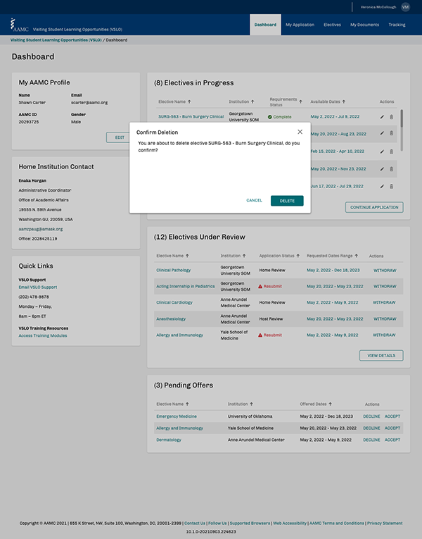

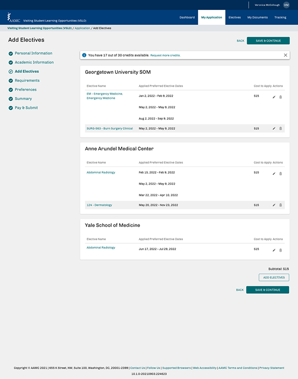
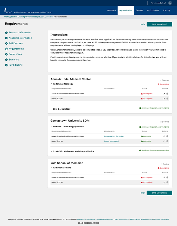
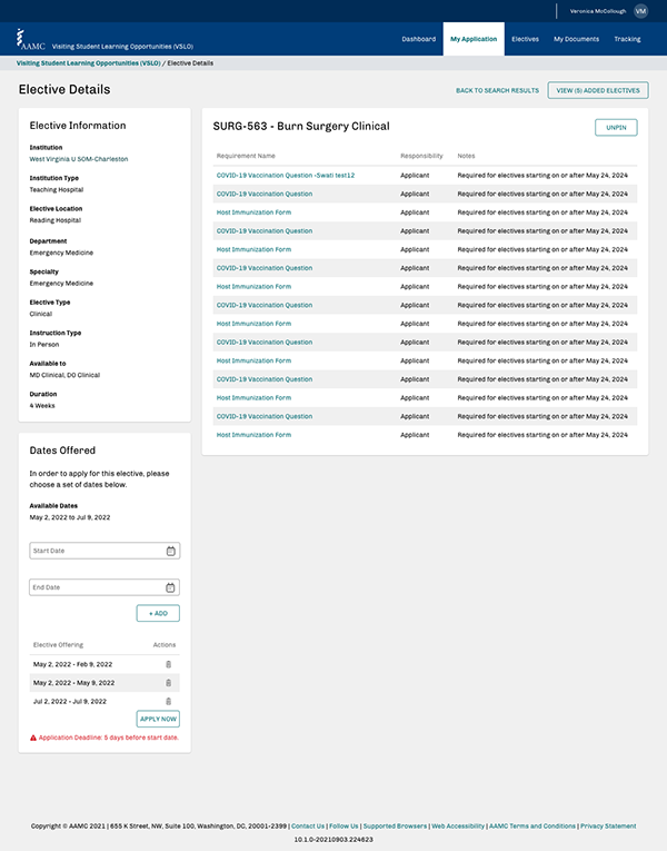
The UI elements were already in place, but the development team was using components interchangeably, thus devaluing the intent of certain click actions. My new proposal and guidelines for case uses were approved, and the development team had a better understanding of how certain patterns could move the students' and professors' application review processes with less friction.
Watch my final demo and listen to the client speak at the end.