Client:
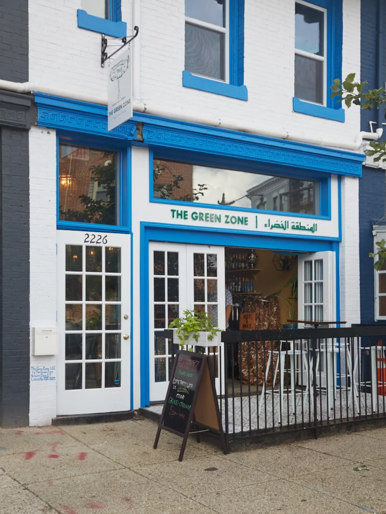
The Green Zone is named after the International Zone in Baghdad and is a way to denote that it is a safe space for people to be themselves. It started as a pop-up bar in a kitchen back in 2018, and it's now one of DC's best Middle Eastern bars and one of the top 50 bars in the US.
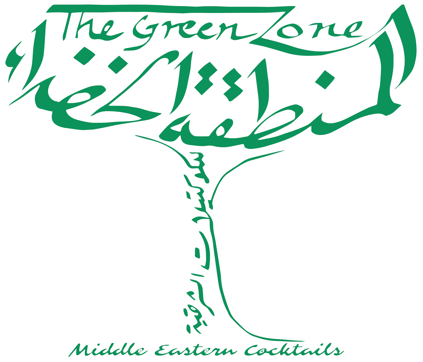
The client had a logo but few brand assets to provide a streamlined experience for its audience. He wanted to modernize the look & feel to portray a socially progressive image, but looked back at nostalgia for its visual cues that endear its diaspora.
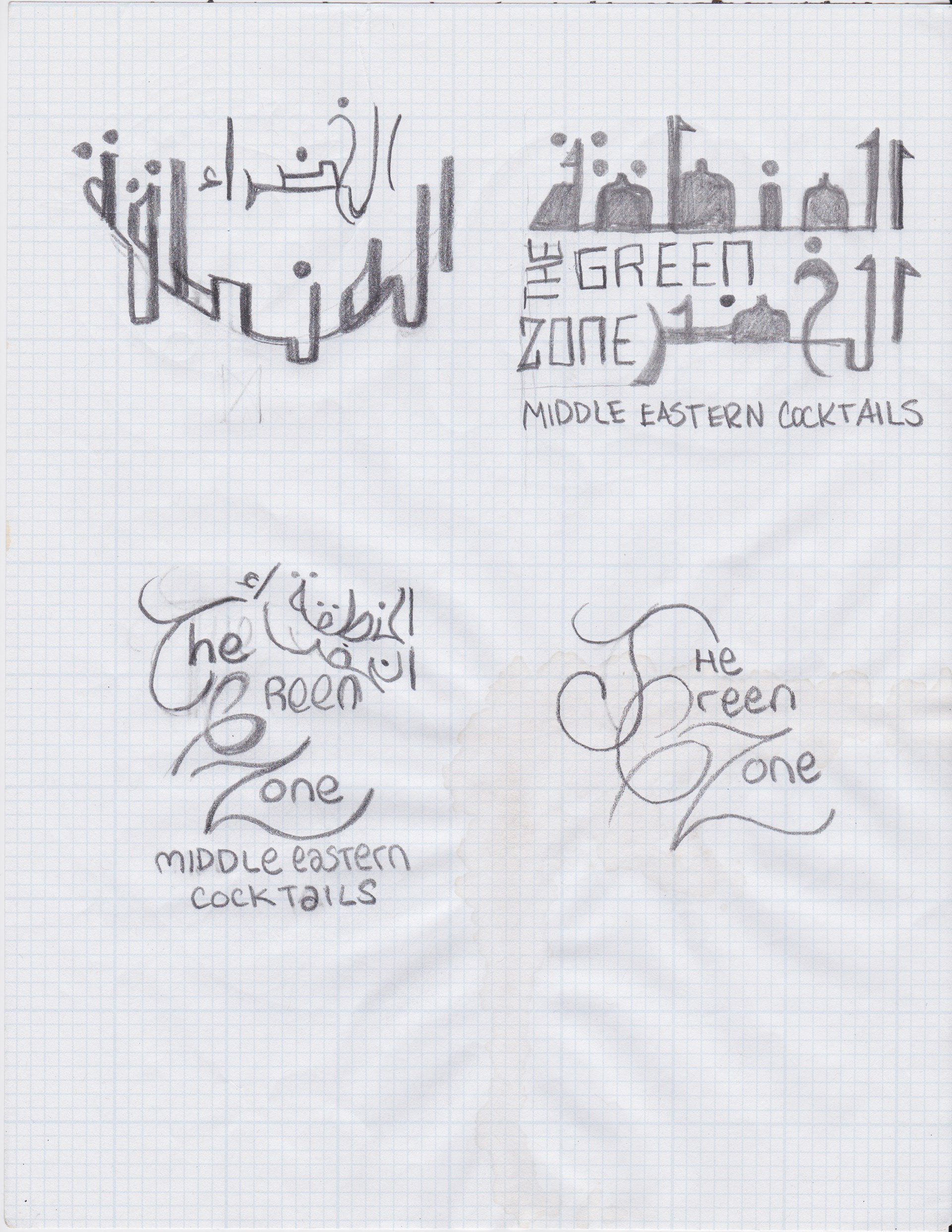
"Please don't make it look like the 'Al Jazeera' logo." - Client :-)
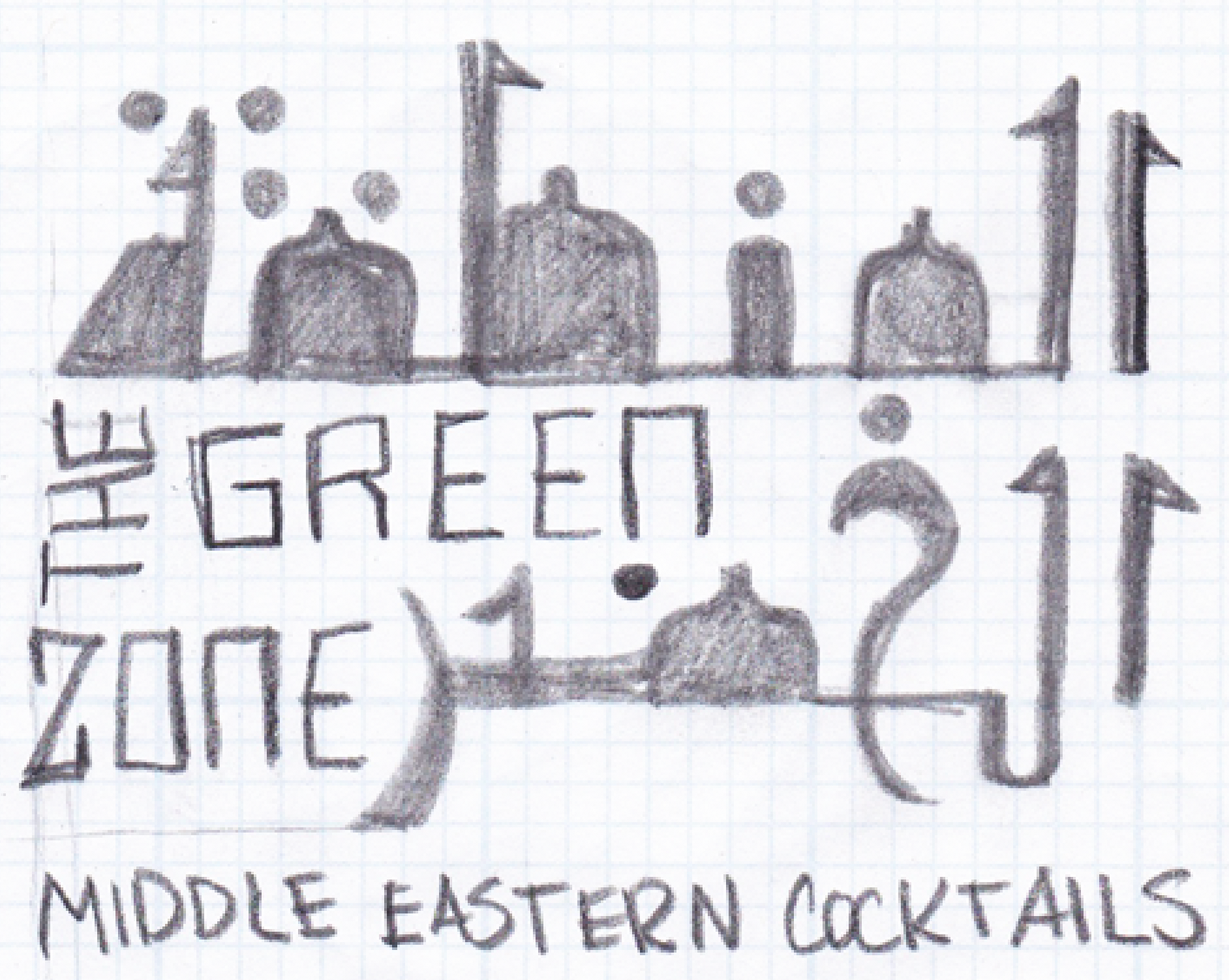
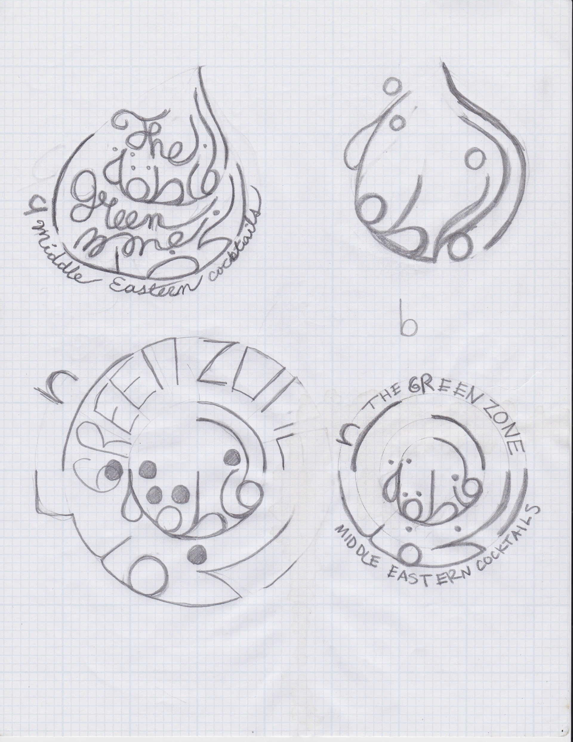
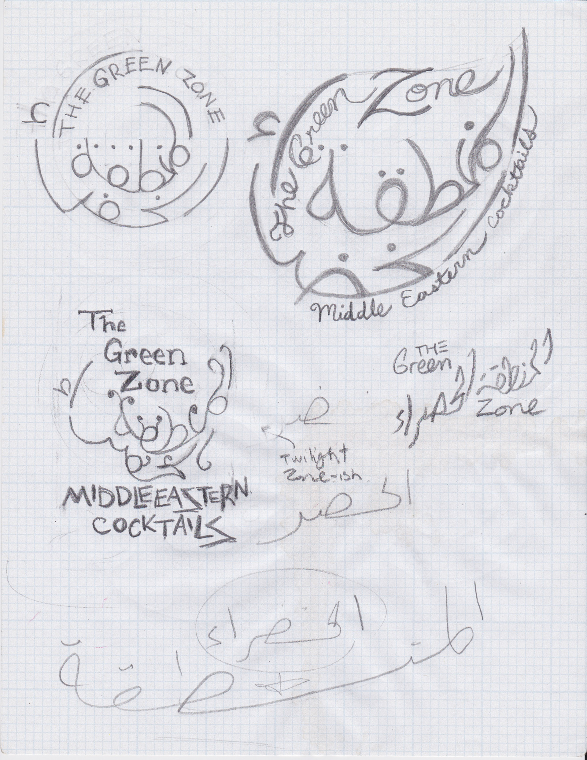
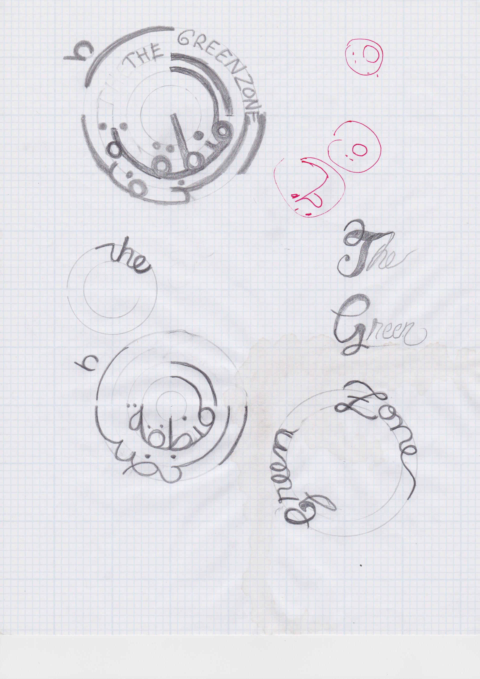
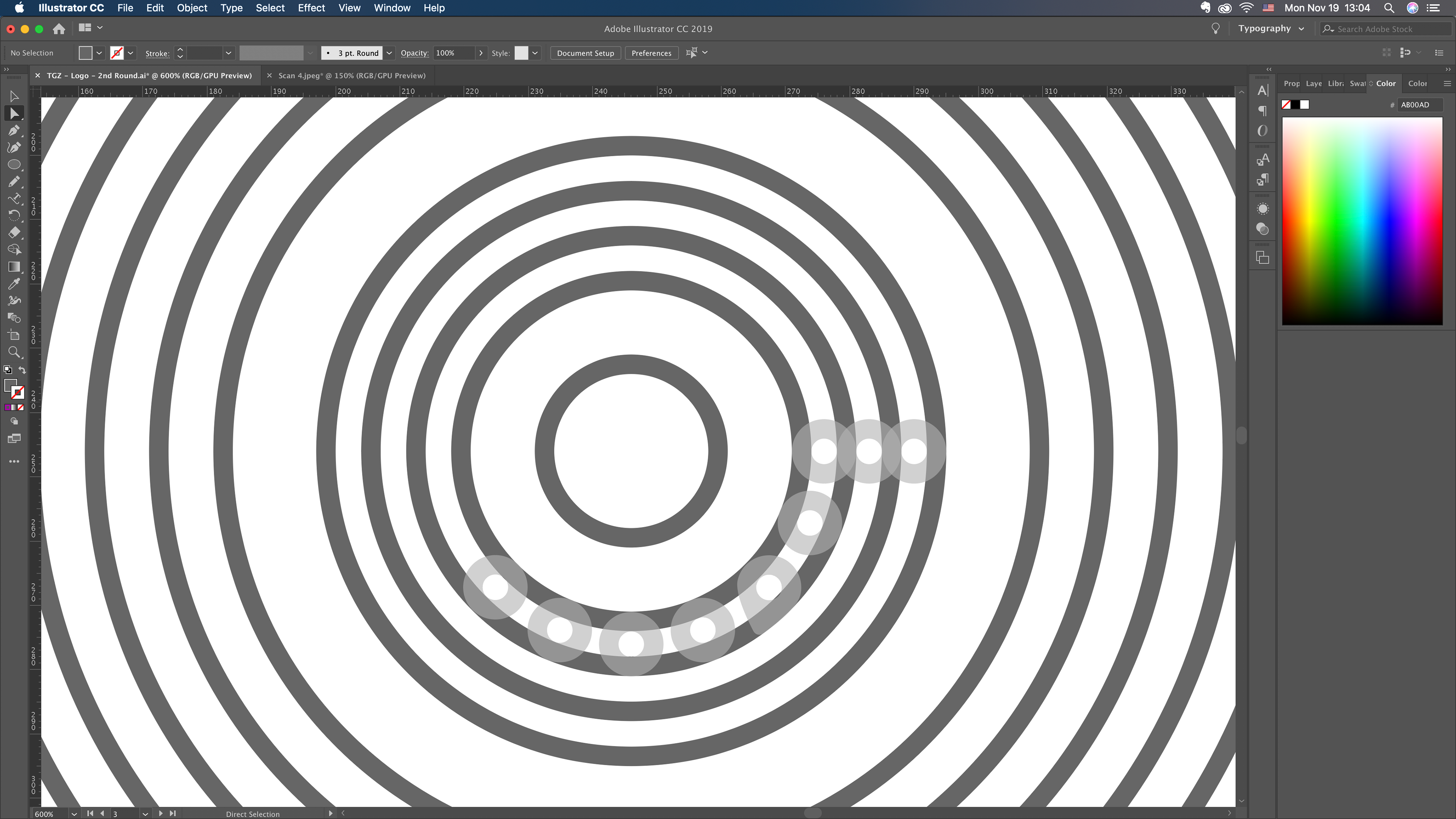
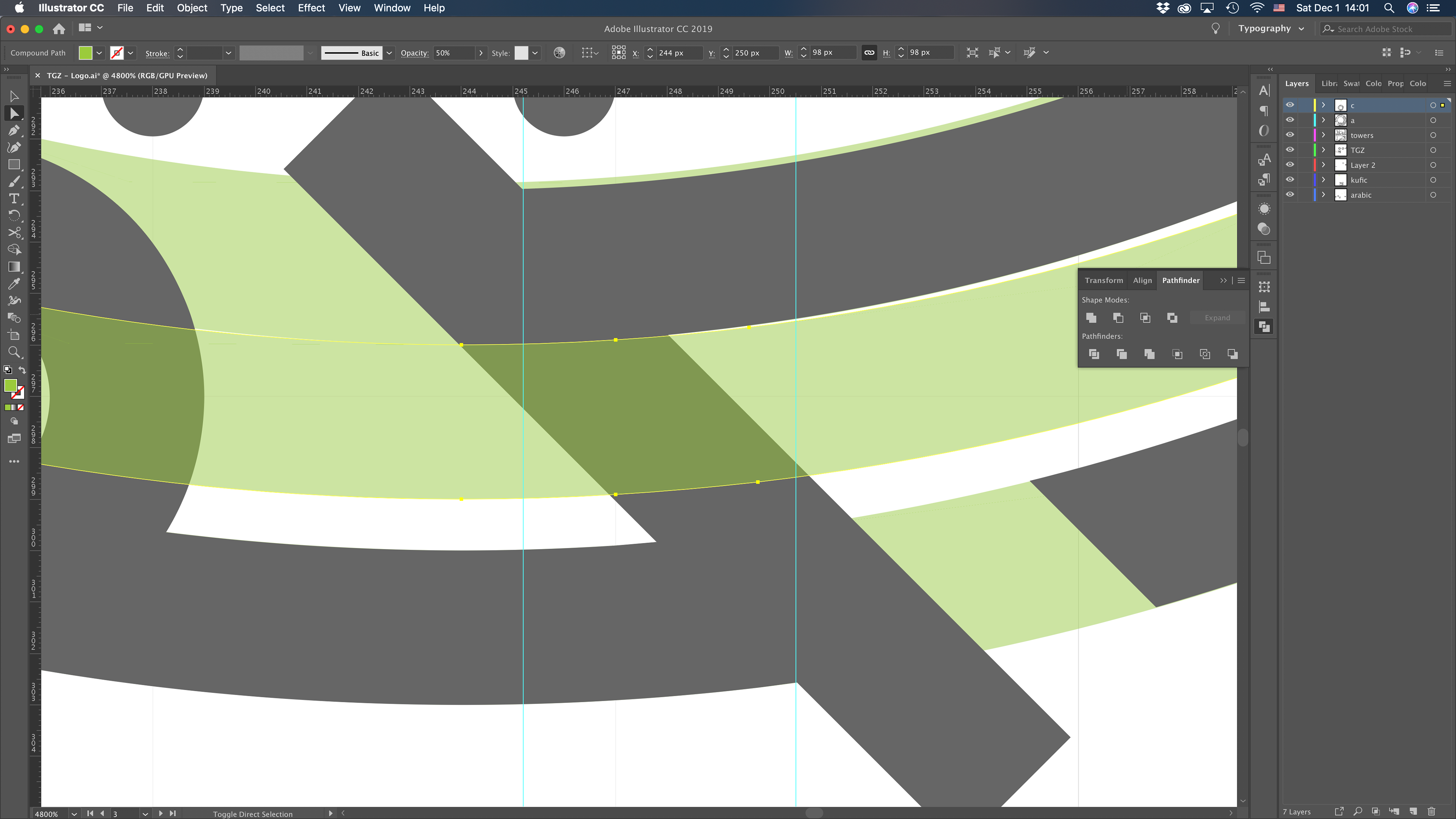
The initial sketches began to look at Arabic typography, particularly Kufic scripts, for their geometric harmony. We might've held on too close to the "zone" and "target" concepts, but it was central to the notion of creating the boundaries of that "safe space" for Arabs in the diaspora and others that appreciate Middle Eastern aesthetics and culture.
The approved direction is beginning to take shape. Also, I don't speak or write in Arabic, but I have access to editors who keep me honest, not just to translate copy but to clearly convey the message.

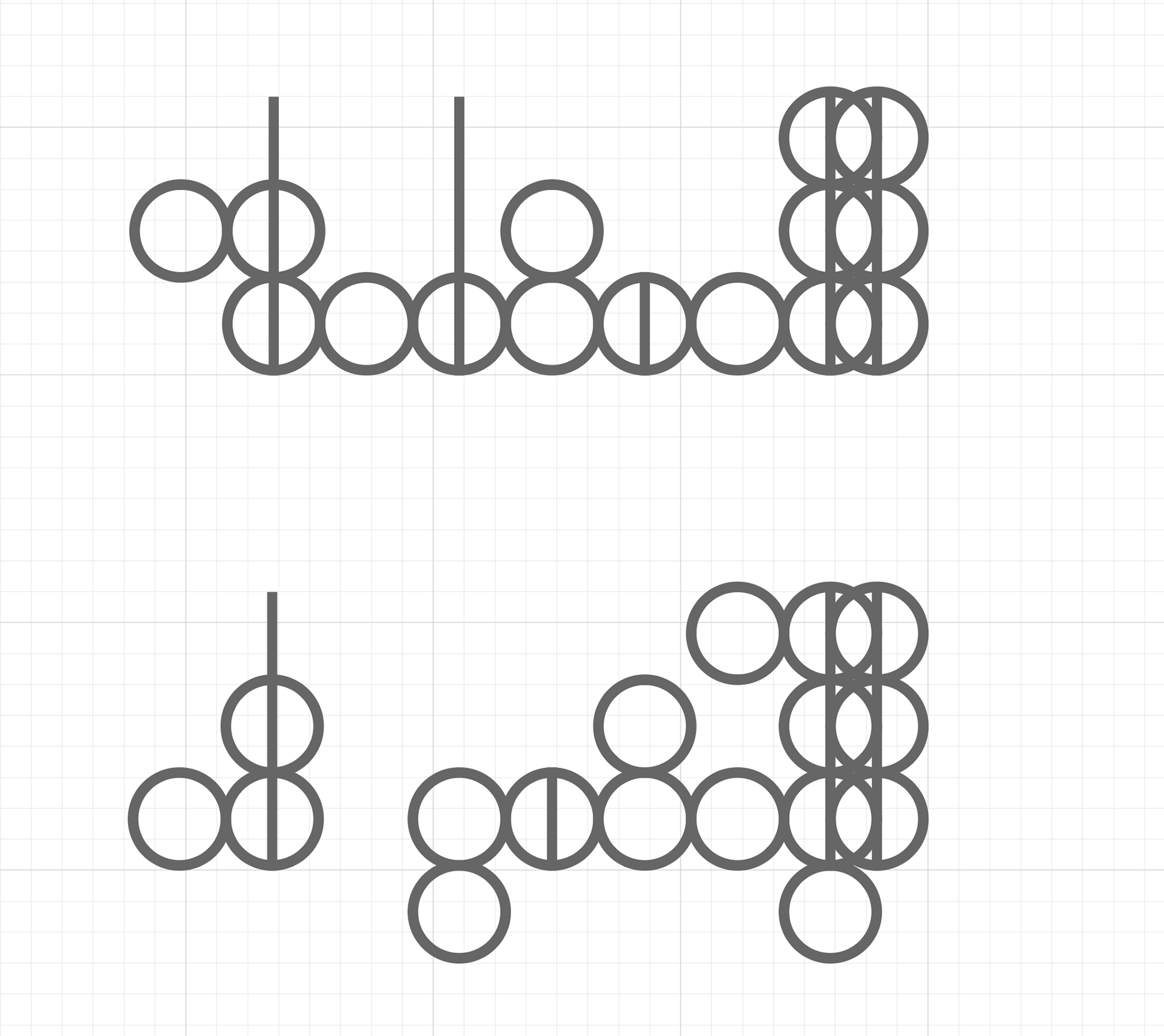
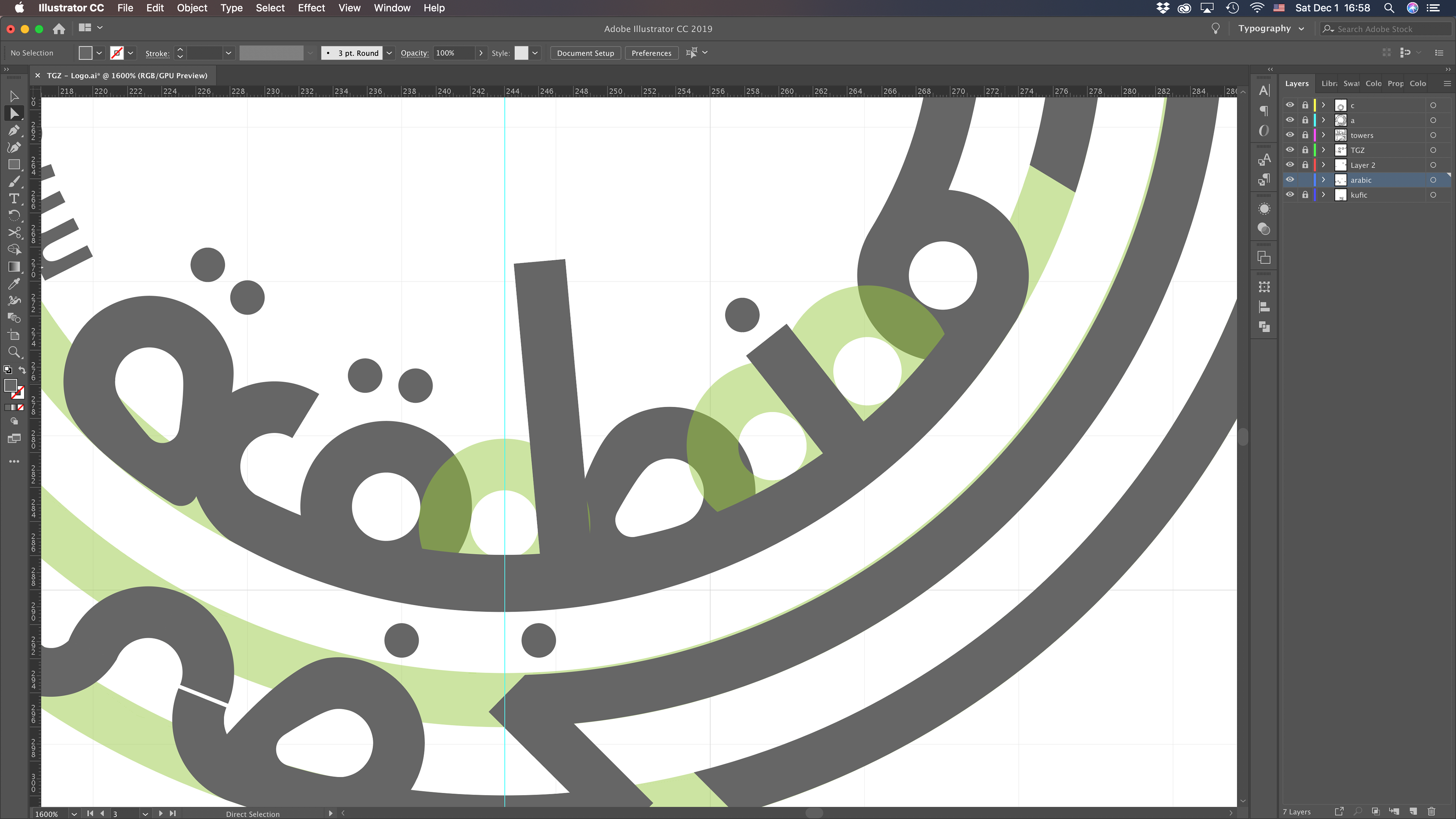
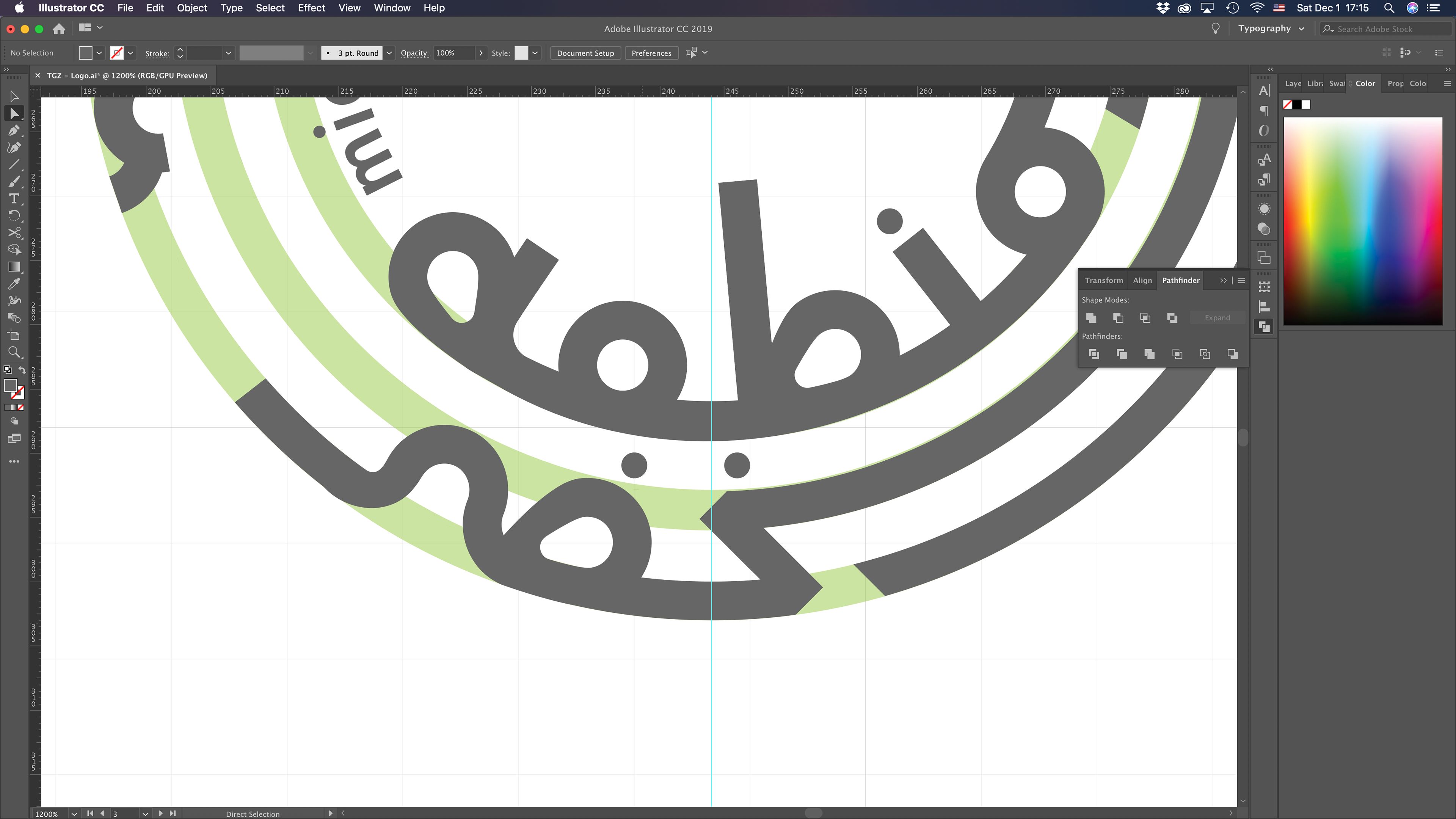
How far can style be pushed without losing legibility?


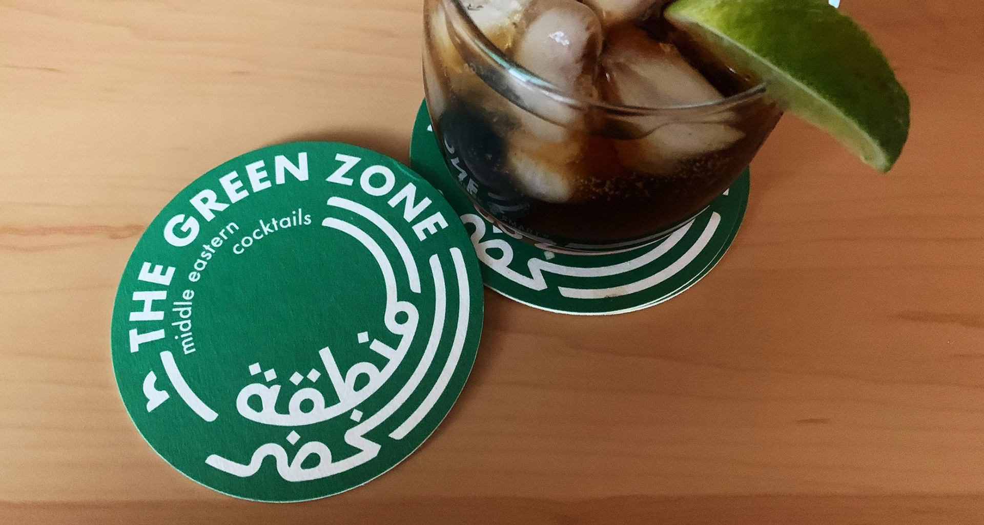
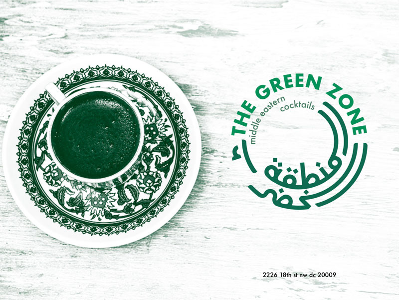
visual identity
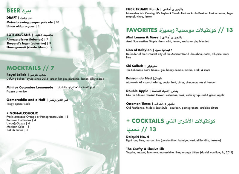
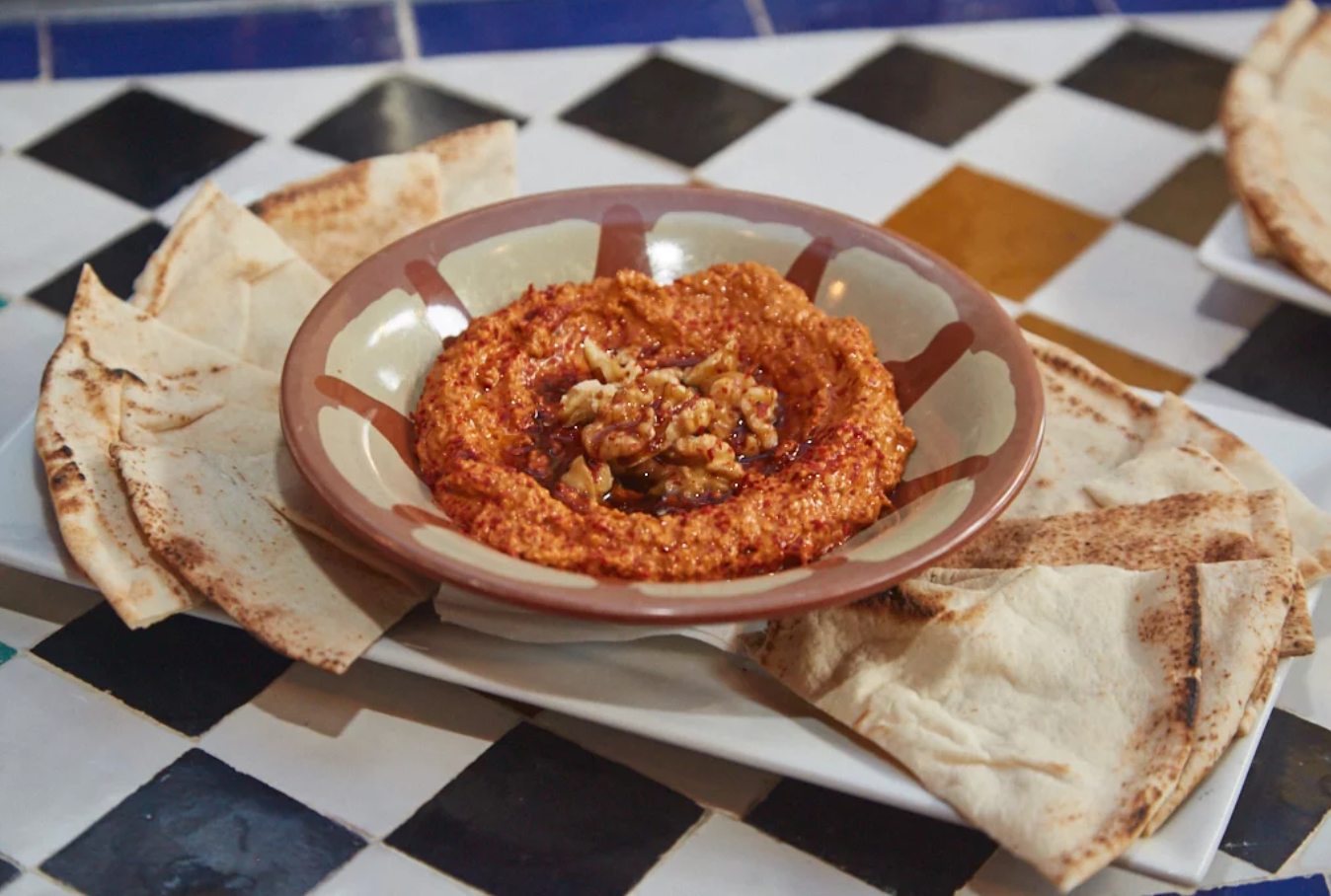
menu (previous)
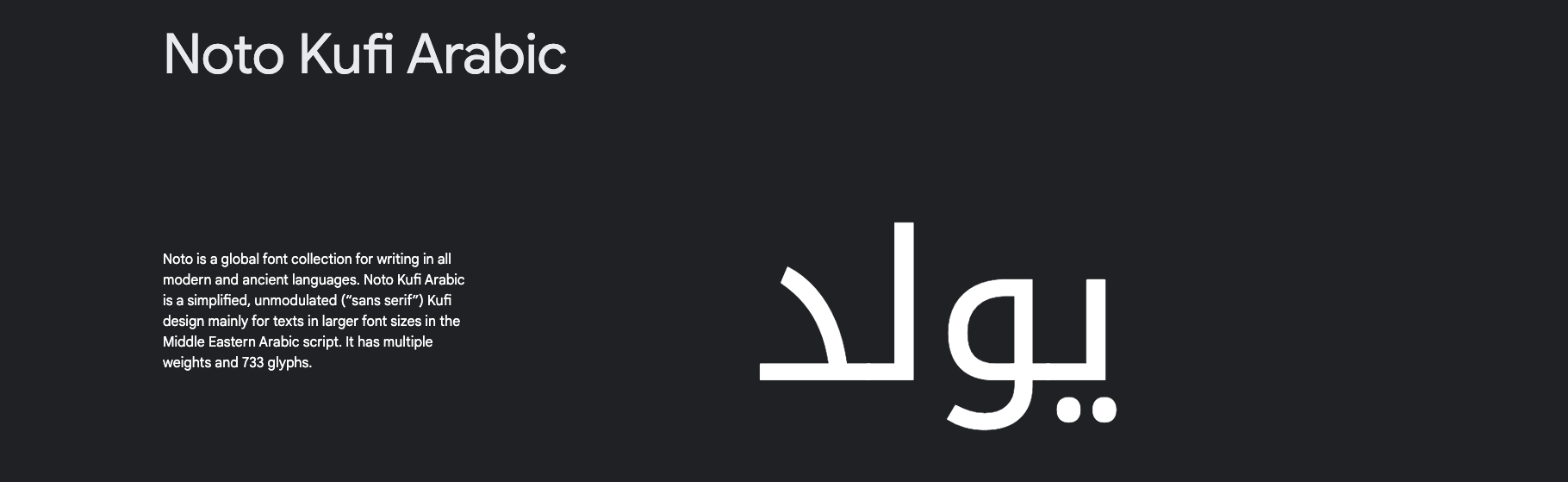
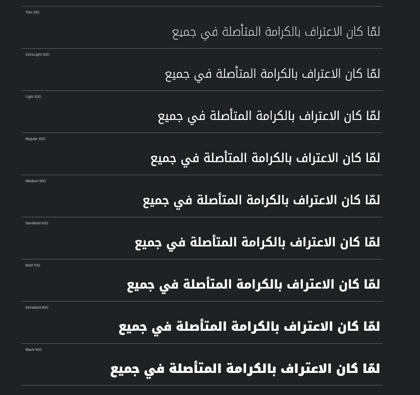
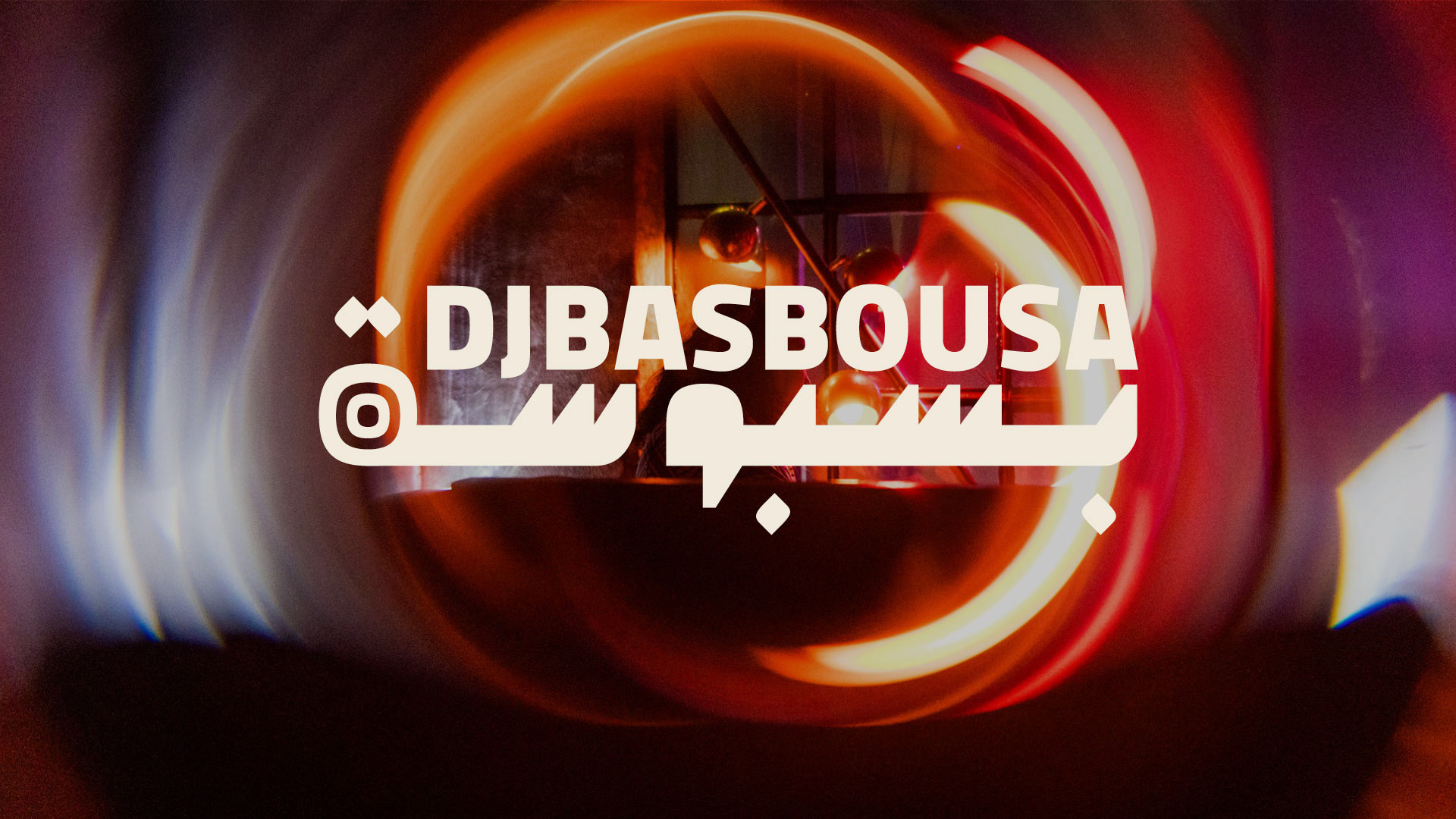
typography: Noto Kufi Arabic. The Arabic typeface was especially important because certain menu items had to be written with phrases that weren't 100% Arabic and borrowed from Persian colloquial terms, for which certain glyphs weren't always present or compatible.
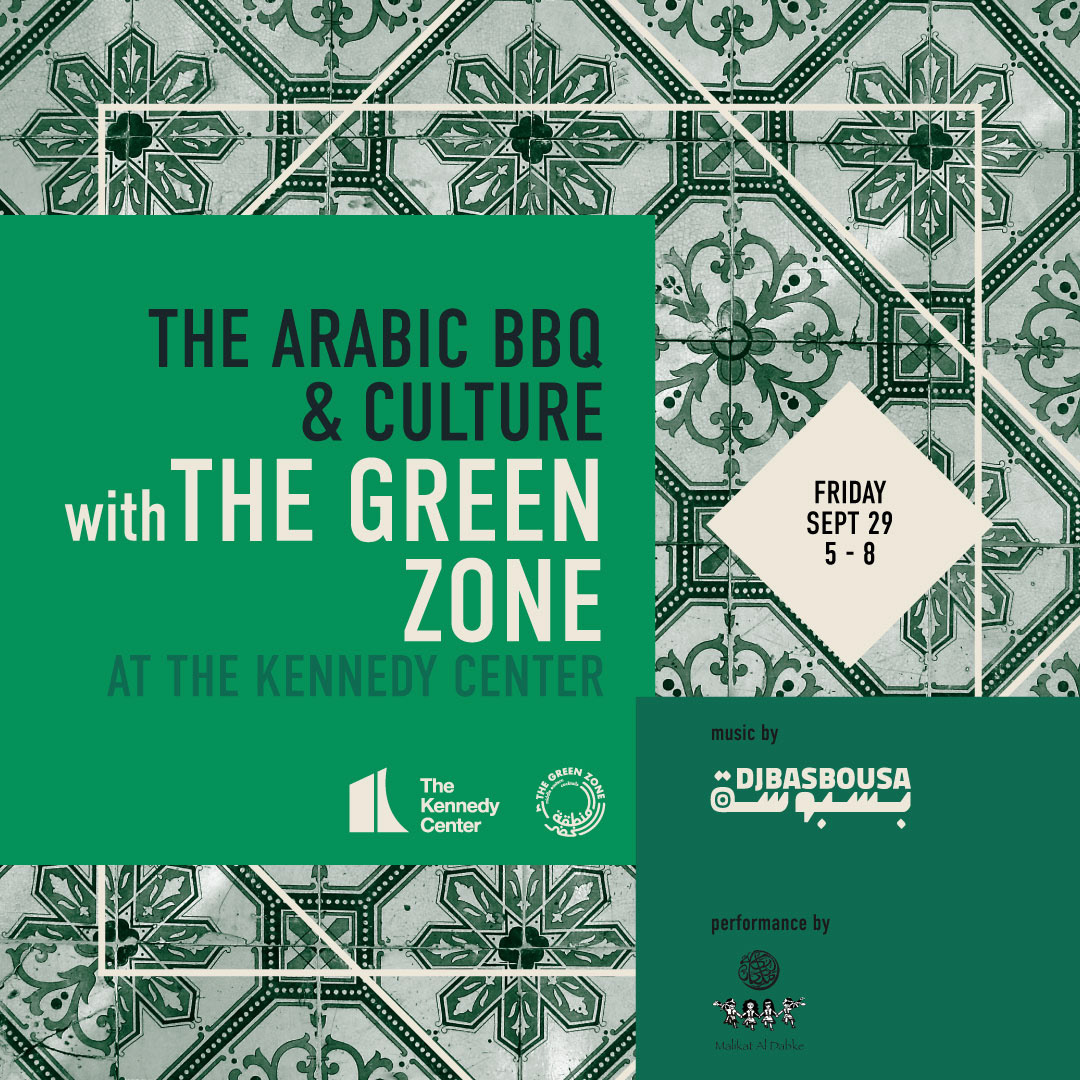
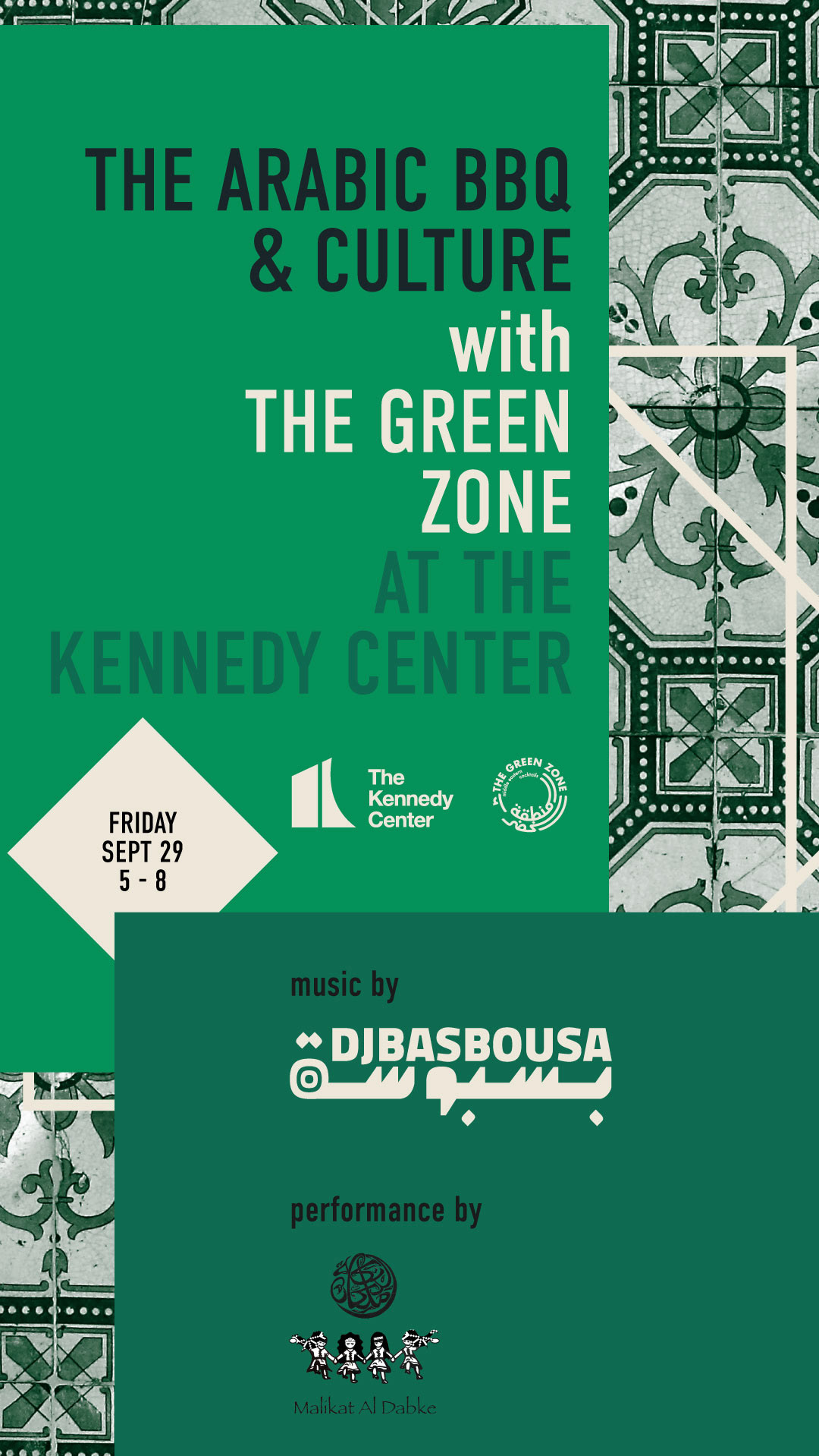
flyers
website
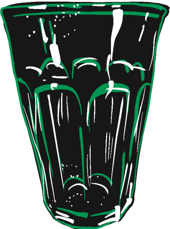
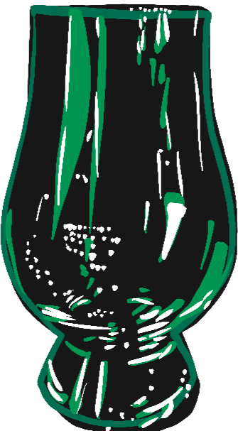
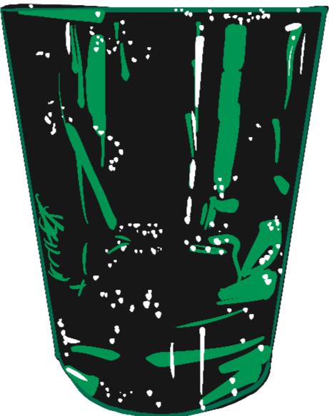

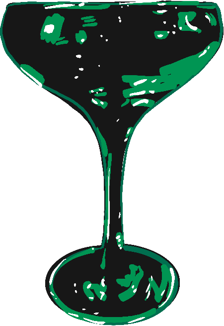
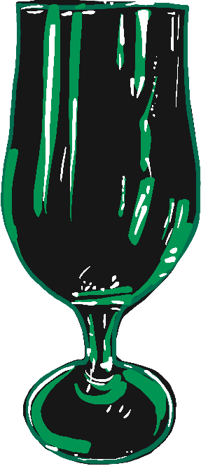
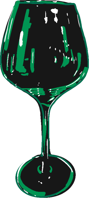
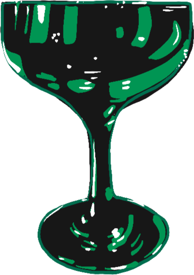
icon drinks library